
What is this?
Good question! ‘Journal’ posts are unlocked, but live with my password protected ‘Creative Process’ posts. I’ve protected those as a means to streamline interest. If you want the password, simply ask from my ‘Contact’ page. 🙂 In other words, ‘Journal’ posts also show process/layout work, but are dedicated to ‘hobby’ works. Enjoy!
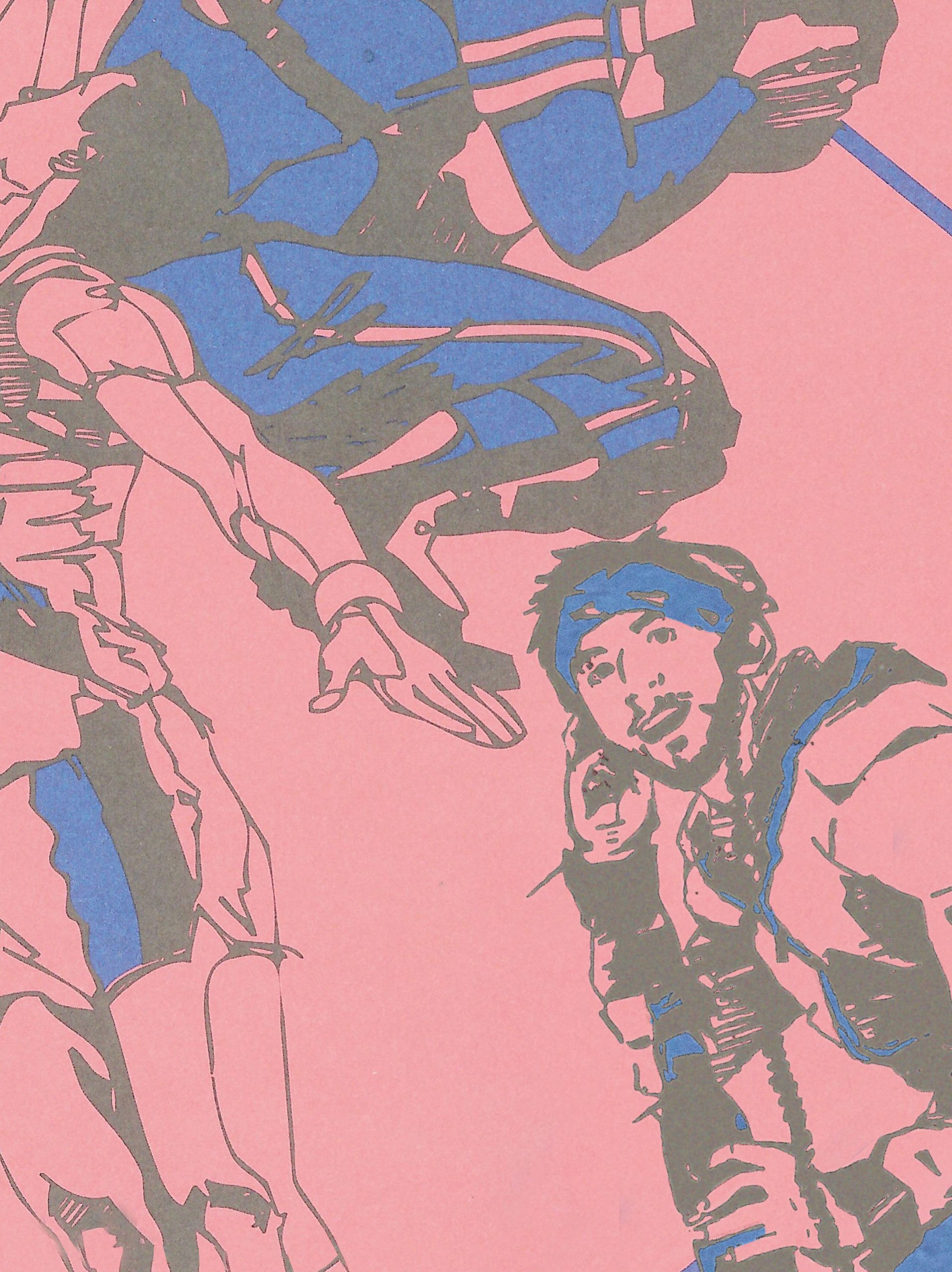
Decided to add myself into a peechee because.. why not!
The American school work folders are so well known. Everyone had one in school growing up, and if they were like me, they probably defaced the original Francis Golden illustrations in hilarious ways. His illustrations feel hilariously dated and milquetoast. I Illustrated myself in the same style as his. I used headphones and 32oz. beer bottle as props keeping it contemporary and add contrast.
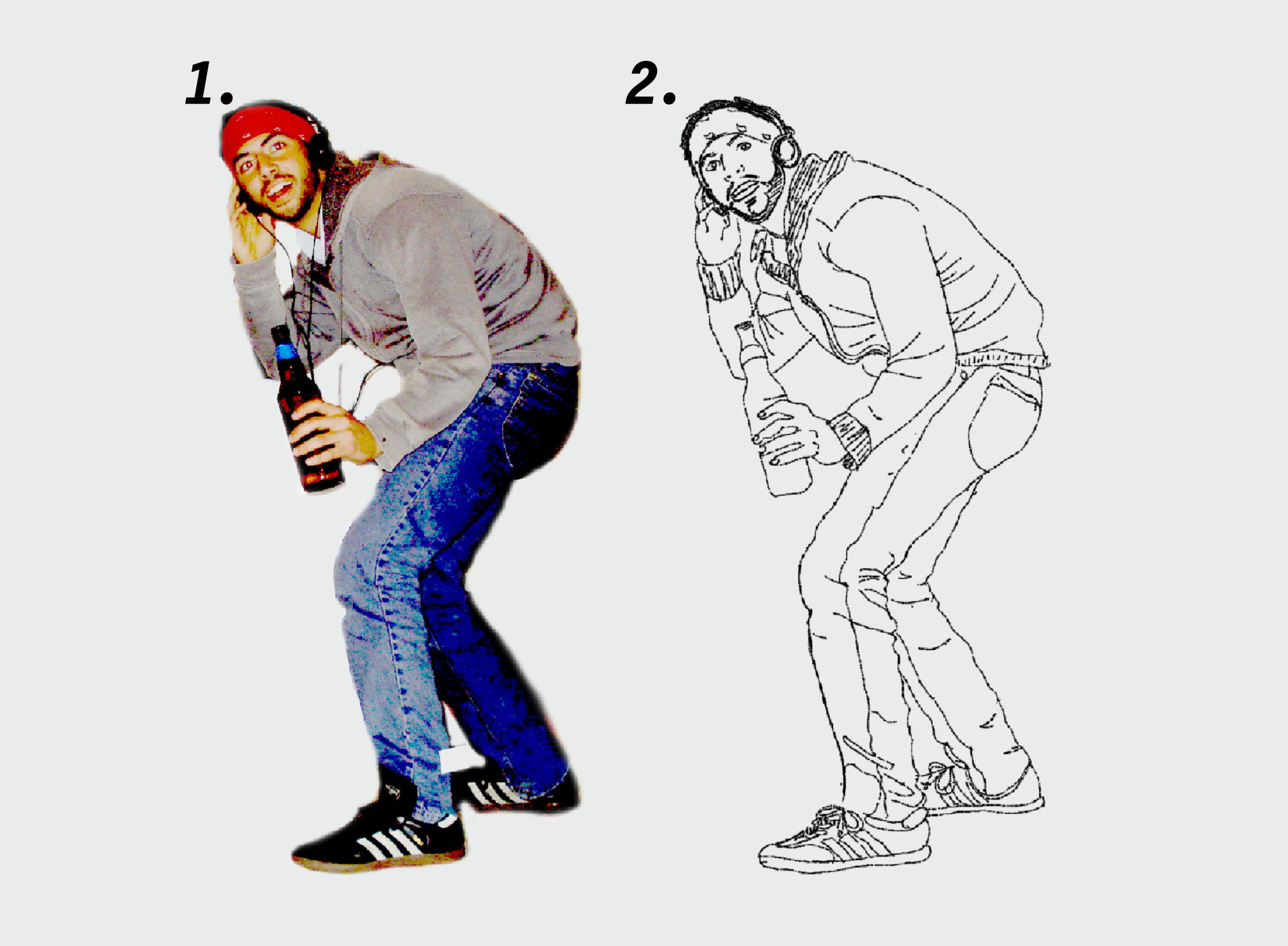
1. Start with a (bad) photo
Snapped a quick photo, and jacked up the levels to make lines as contrasting as possible. Photo is grainy and terrible, but was I merely going to draw over it anyway.
2. Basic line drawing
I traced over the photo using my Wacom Intuos Pro with a small nib uniformly sized brush. I consider early sketches like these my ‘scaffolding’. I print these simple illustrations out, tracing over them. In this case it’s with tracing-paper and a thick pen. I tend to illustrate better on paper than through Wacom, so I always go by hand to add real details if possible.
3. second-pass on tracing paper
Tracing on tracing-paper with a thick pen I add hatching, basic inking, and movement lines. I tend to have an unsteady caffeinated hand. My lines are ‘hairy’ and un-illustrative, concentrating energy into my hand instead of my arm. I’ve tried breaking this over the years, but tend to forget while im focused. This is generally why I illustrate images two to three passes, instead of one.
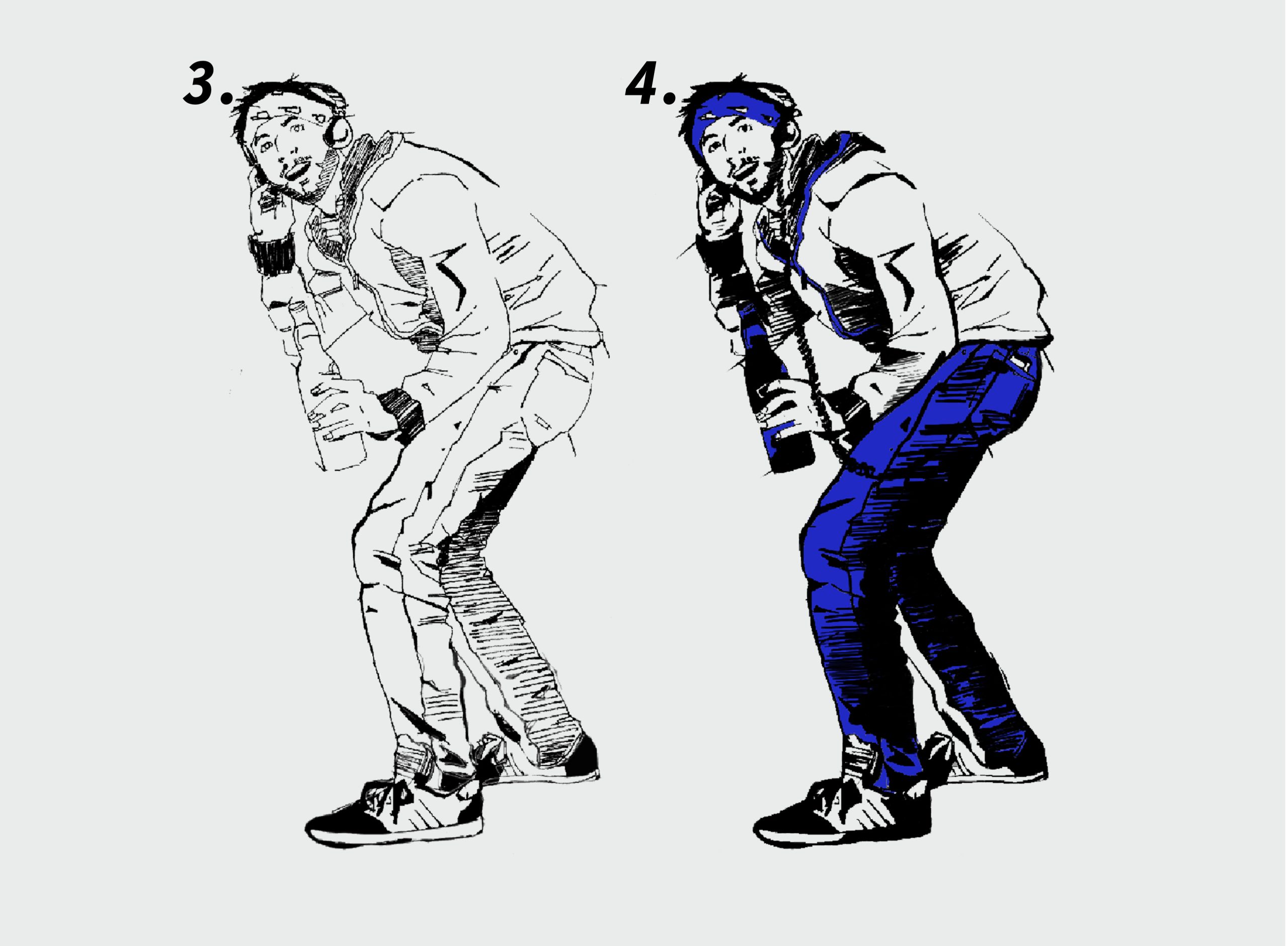
4. Third-pass digitally, again
Drawing over the hand-drawn tracing-paper illustration one last time. For this pass, I used fast strokes, and a digital pen that emulates the look and feel of the original illustrations. This time I fully inked and colored the illustration.
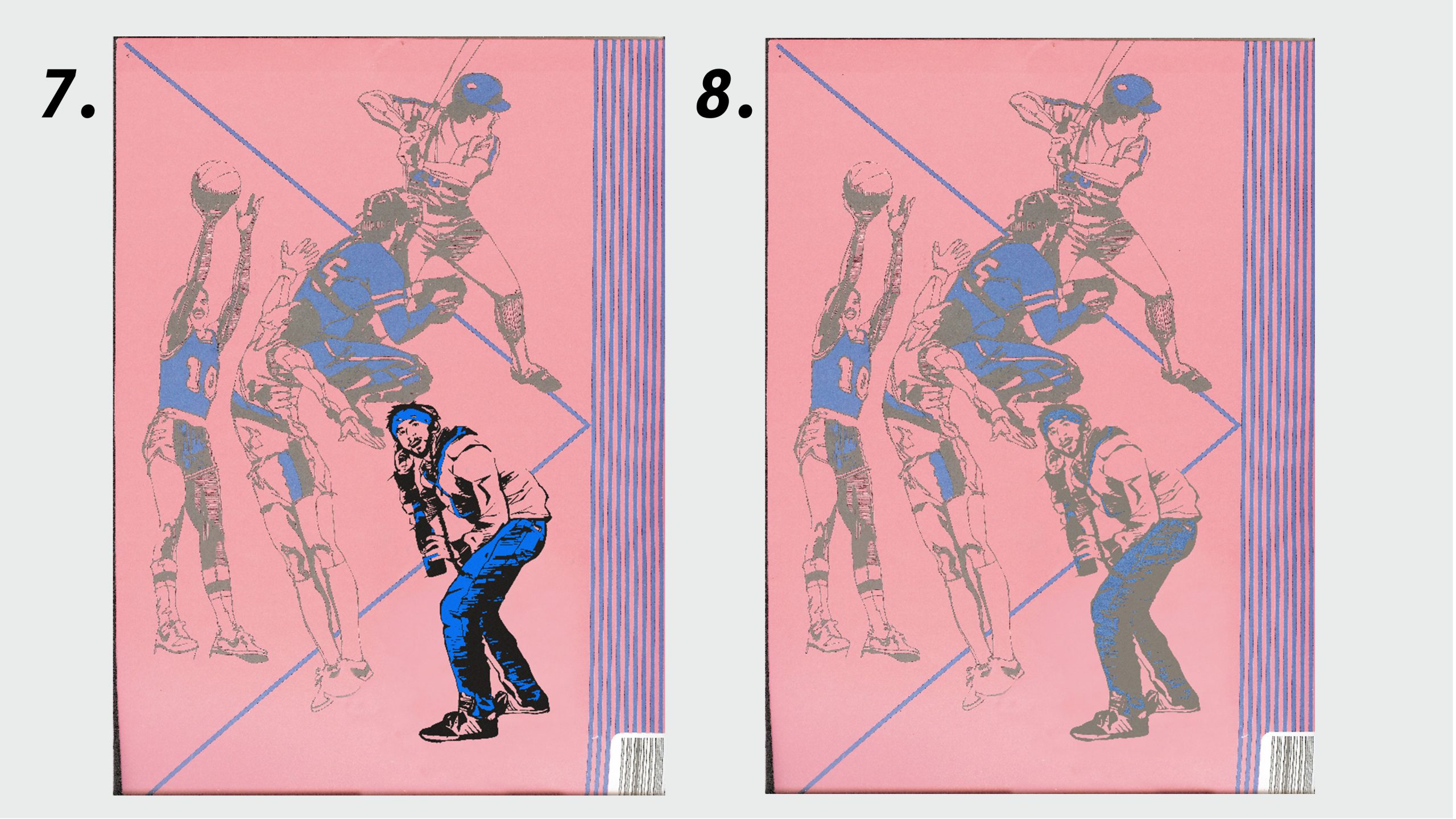
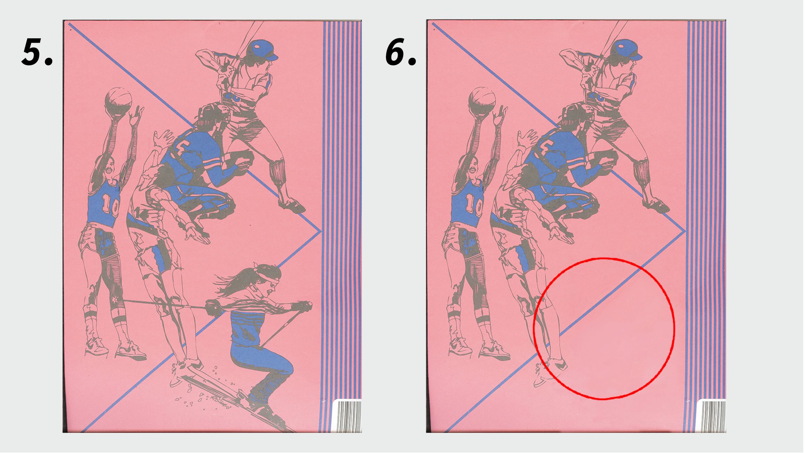
5. Who to replace?
To make space for my illustration, i needed to remove one person. I chose the skier on the back because she takes up a smart amount of space, and isn’t overlapping the other illustrations much.
6. Nix the skier
Using Adobe Photoshop, I used a Healing Brush, Clone Stamp, and Lasso to copy and paste other sections of the pink paper, blending it all with different opacities and gaussian blur, keeping the texture. The skier’s pole overlapped the basketball players leg, so I patched it it by cloning parts of the existing illustration.
7. Paste the new boozer
My new illustration fits the look and feel after sizing it appropriately. Removed the diagonal blue stripe via Clone Stamp so it didn’t intersect my illustration. The illustration is too bold in color and tone, stands out like a sore thumb. Many subtle adjustments were made.
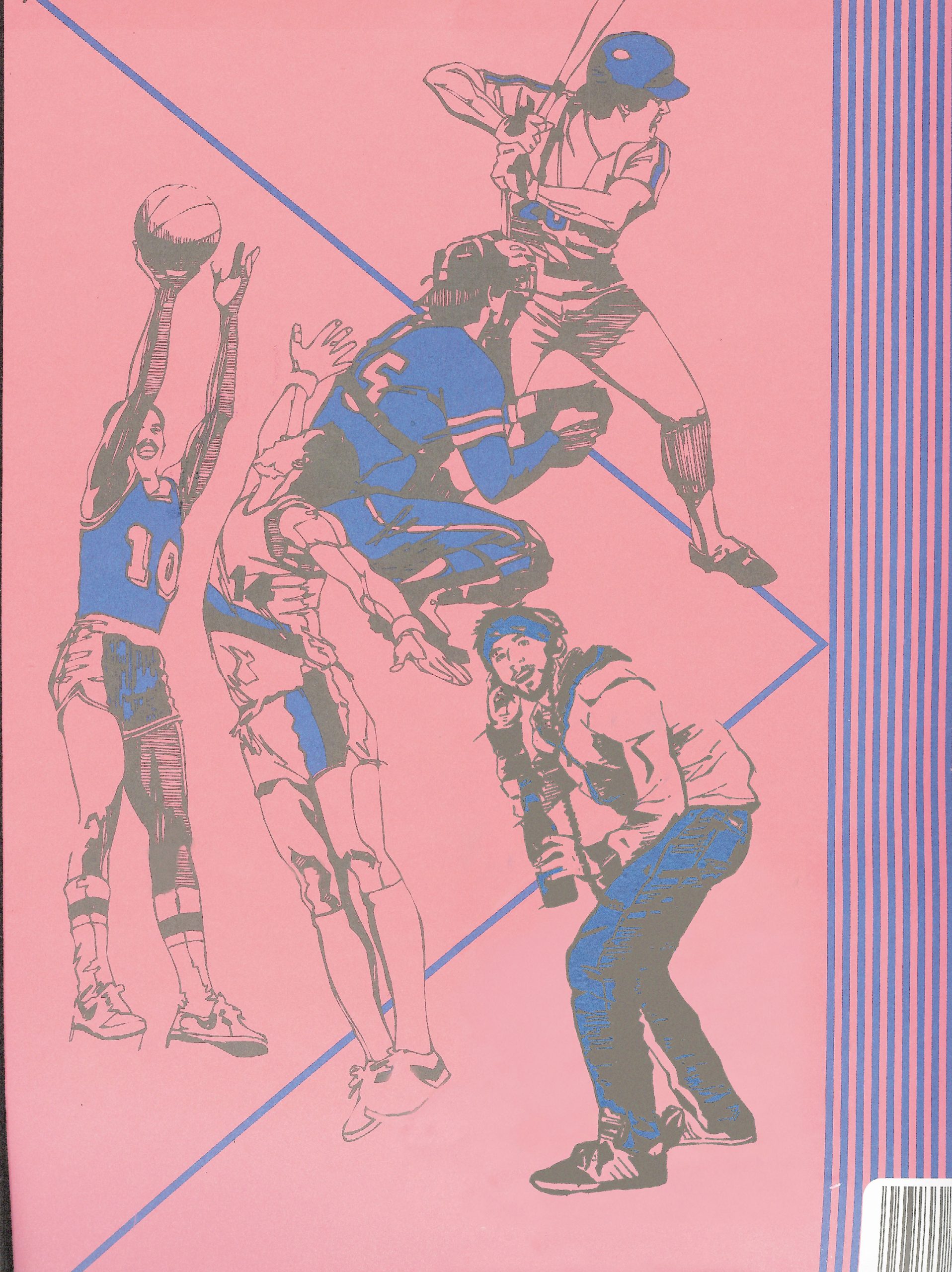
8. Time for the velvet gloves
These posted images really don’t showcase the subtle production I did to make this work. I used a variety of tricks until it matched.
- blue color-blocking and black were separated, adjusting tone and contrast until they matched existing illustrations
- Noise was added with gaussian blur matching the texture of existing illustrations
- Layer Styles, ‘Stroke’ and ‘Outer Glow’ were used with heaps of noise to match the wet edge feel of the existing illustrations
- Threshold and Displacement softened the feel and help further the natural wet edge / ghosting look